Obsah
This page is here for historical reasons. You will find the updated version here
Manage main menu
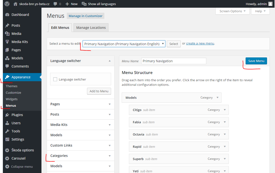
The main menu of BNR site is manually created. It basically represent all post categories, but you can full control it from administration. Open Appearance > Menu from left side menu.
- First check what menu do you have selected. You can change it in section „Select a menu to edit“. Choose what you want and press Select button.
- Under Menu structure headline you can manage all menu items by drag&drop. Open detail settings by click small triangle in right of each menu items.
- If you want to add new menu item, select type from left side boxes. In BNS we use only Categories. Note: When you add new menu item, it will be as last item in the list of menu items.
- When you are ready, do not forgot to press Save Menu button to make your changes visible!
Mobile menu switch
By default, the mobile menu is shown only once the window is smaller than 768px as seen here:
An administrator can define a different size for his site, so the mobile menu is shown even on larger screens. Look at the following example, where we have several items in the menu, this is a screen from a large desktop:
When we view the site on a smaller screen, for example a tablet, the menu will not fit between the logos and jumps down as seen here:
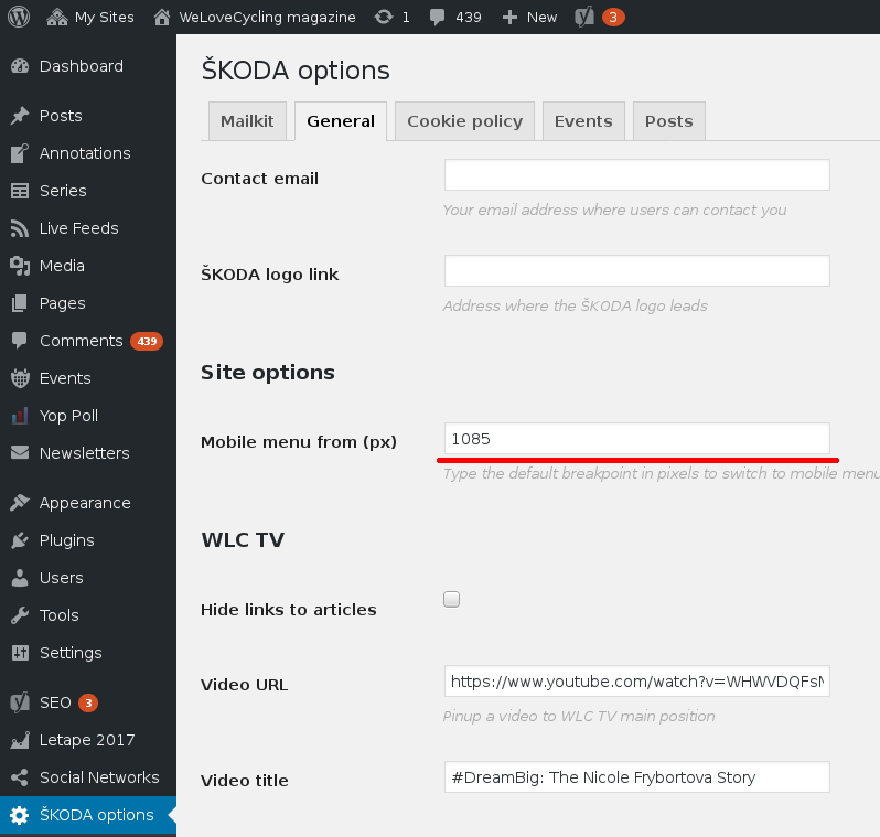
To fix this issue, you can go to SKODA Options → General and specify a different size when to break to mobile menu
When you specify this size, you will see a mobile menu when the screen is smaller than this size
How to determine the size to break the menu
First you need to open a mobile view in your browser, navigate to your site
Google Chrome
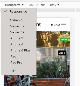
Press CTRL+SHIFT+I - when the console opens press CTRL+SHIFT+M. At the top, you will see a dropdown, which could say „Galaxy S5“, „iPhone 5“, „Responsive“ or similiar - click the dropdown and select „Responsive“
Mozilla Firefox
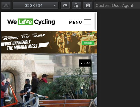
Press CTRL+SHIFT+M
Now you can play with the first numerical value (which is the width of the window) - in our case it shows 320 … once you find the proper size where the menu is shown correctly you can use it in the options in administration
Manage footer menu
Footer menu is split into two separate menus. Left Footer menu and Right Footer menu.
Each can be edited by going to Administration → Appearance → Menus
First you need to create a menu if it does not exist and populate it with links. Once links are in place you have to select a menu area, where this menu will be located
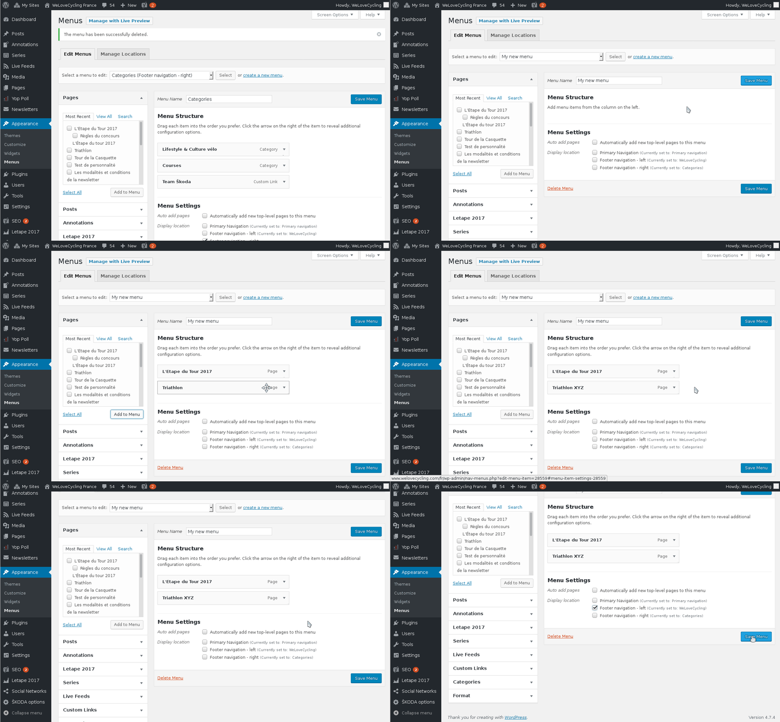
You can only assign a single menu to any location at a time
